Internal Tools for Marketing Design | 2018-2019
Woring smarter and faster with libraries and templates

Libraries and templates are increadibly useful resources that ensure consistency and save time so designers can focus on more important things like actually designing. Product designers don’t recreate modules in Sketch every time—they use symbols. So why shouldn’t marketing designers do the same?
Building an Illustration Library
Creating the library started with (1) compiling all previous illustrations, (2) identifying what was inline with the new branding vs. what needed refreshing, and (3) condensing duplicate assets.

This left us with a modular illustration system that allowed a designer to pull assets and create an entirely new composition that was visually consistent but still fresh. I created a single shared Illustrator file and we kept clear communication amongst the team to efficiently maintain the library.
Using Sketch in Marketing Design
Sketch isn’t commonly used in Marketing Design, but sometimes Illustrator just isn't the right tool. In this case, it was more time consuming and not as accurate.
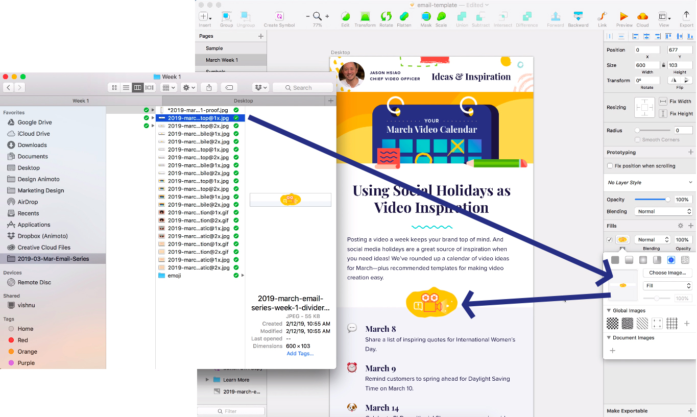
To solve this, I created a template in Sketch for our weekly email series that allowed us to simply drag and drop to replace images, use text styles and symbols, and create proofs with consistent spacing that more accurately followed development capability. Illustrator was only used to make the illustrated assets.
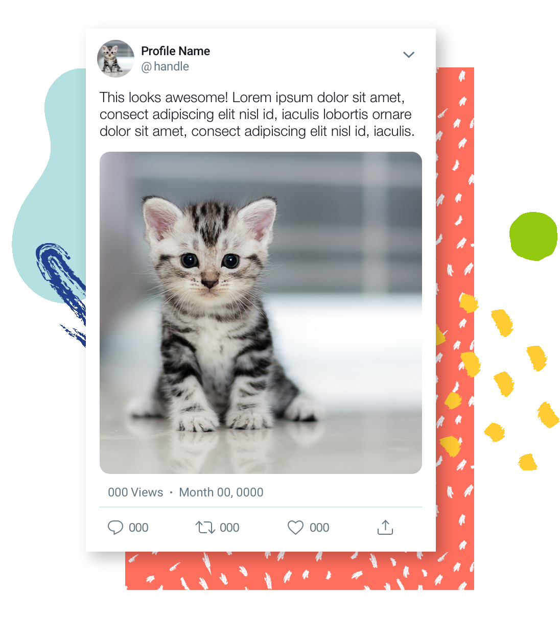
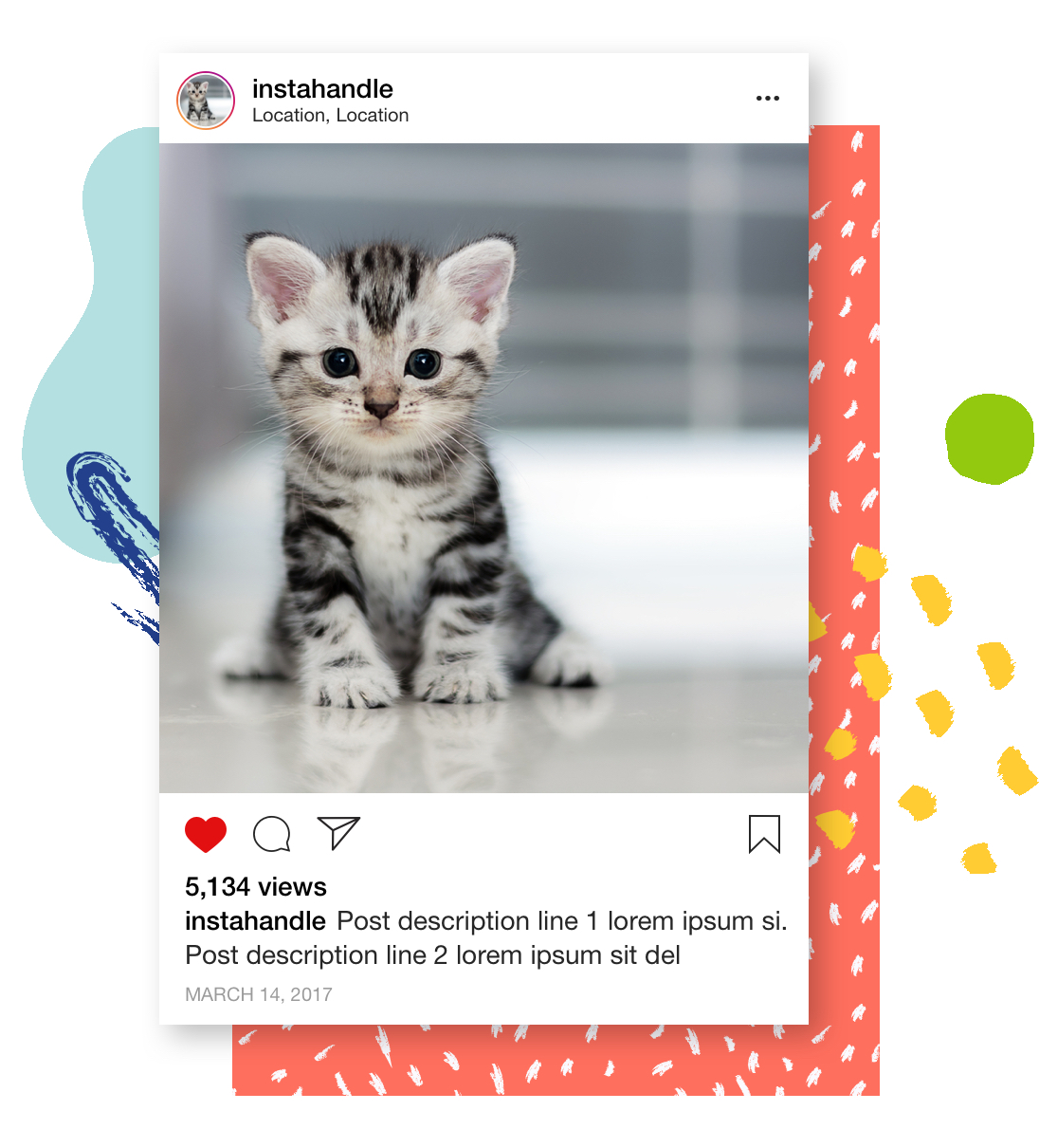
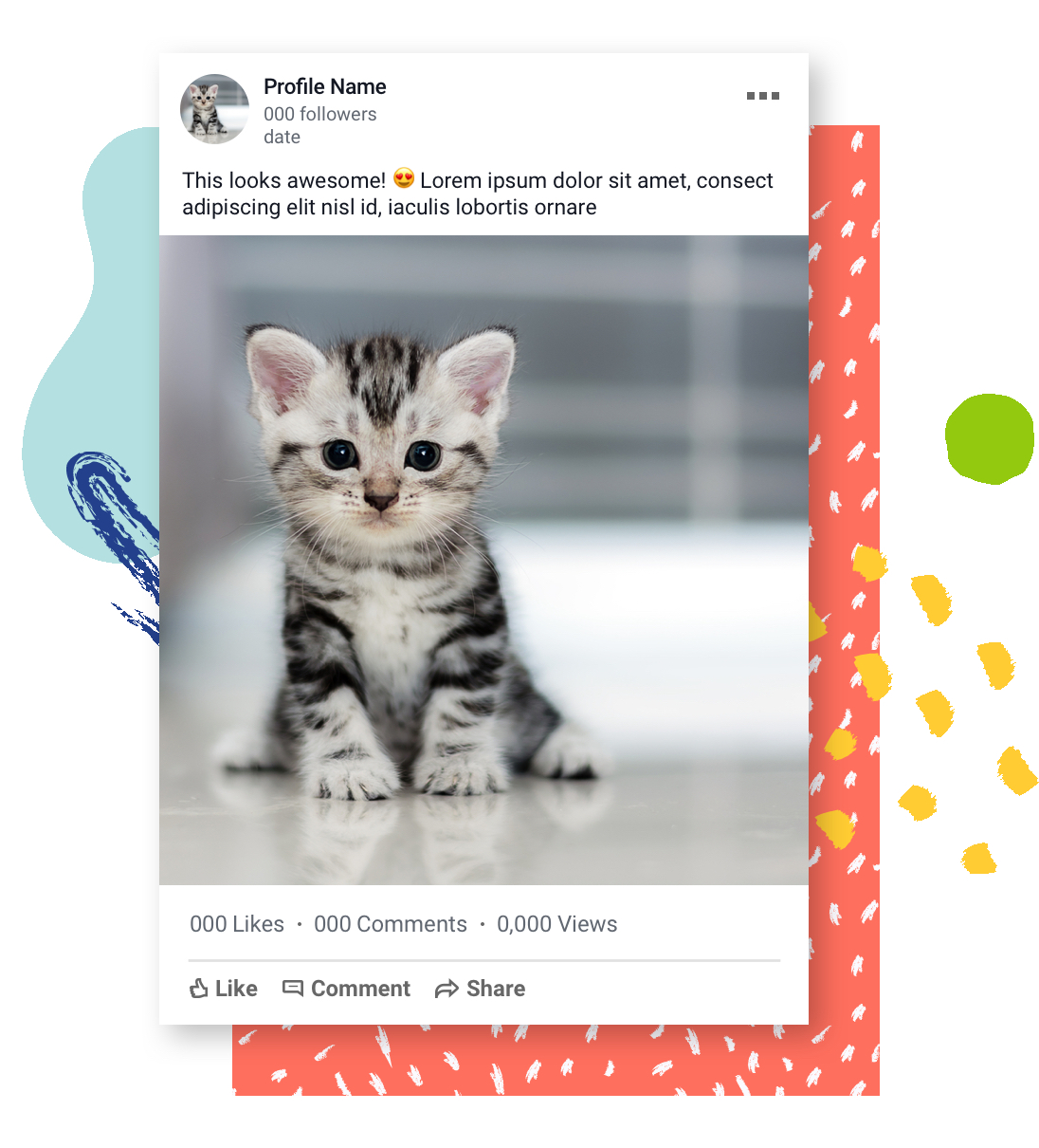
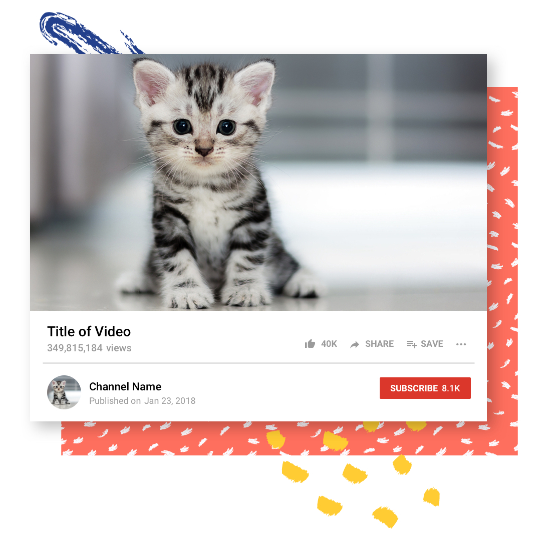
I also created templates for our success story assets—snapshots of social media posts from our outstanding customers. Illustrator required annoying clipping masks, nudging around text, and effort to keep things aligned. With Sketch, we could enter the text (spacing would adjust automatically) and easily toggle on and off elements like Facebook reactions.
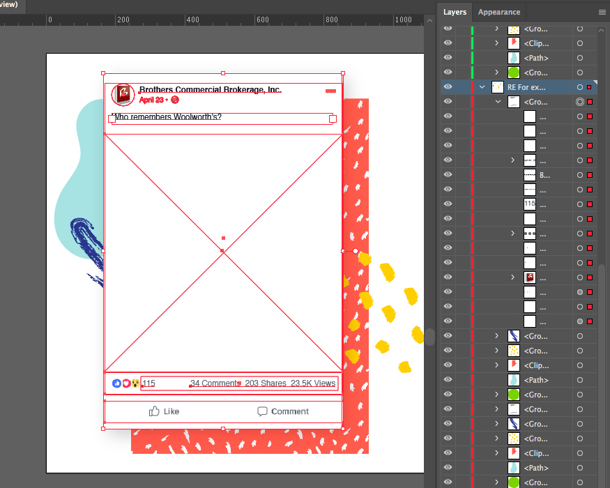
Illustrator: difficult to edit, less organized, no cats
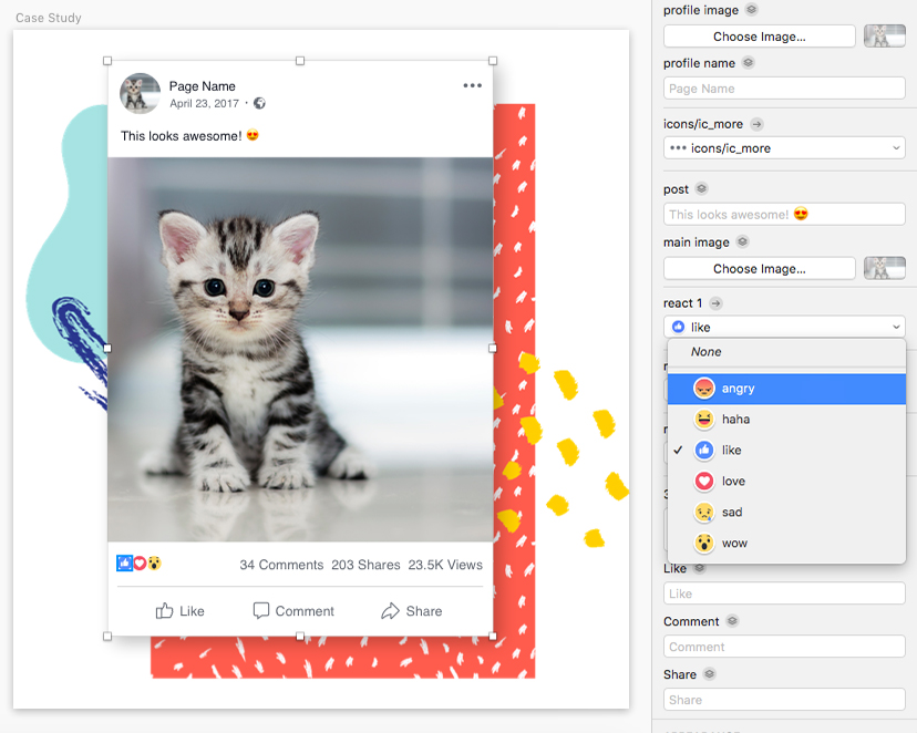
Sketch: easy to edit, clearly labled, cute cats
